A Dashboarding Tool with Bird APIs
·

Key Takeaways
Bird APIs can be combined with Python and Plotly Dash to build powerful, interactive dashboards without needing the full Bird UI.
The project demonstrates how to visualize metrics and events using Bird’s Metrics API and Events API within a custom web app.
Plotly Dash provides a quick, open-source framework for building UI elements like dropdowns, charts, and tables.
Developers can extend the tool with deliverability analytics, filtering, and pagination for richer dashboards.
Future enhancements include caching, improved UI, and integration with other Bird products or third-party APIs.
The codebase (available on GitHub) offers a strong starting point for anyone wanting to build Bird-powered dashboards or customer-facing portals.
Q&A Highlights
What is the goal of this dashboarding project?
It demonstrates how developers can use Bird APIs with Python and Plotly Dash to create data-driven dashboards that visualize campaign metrics and recent events.
Why use Plotly Dash for Bird APIs?
Dash is open source, easy to customize, and ideal for creating interactive UIs without requiring front-end expertise.
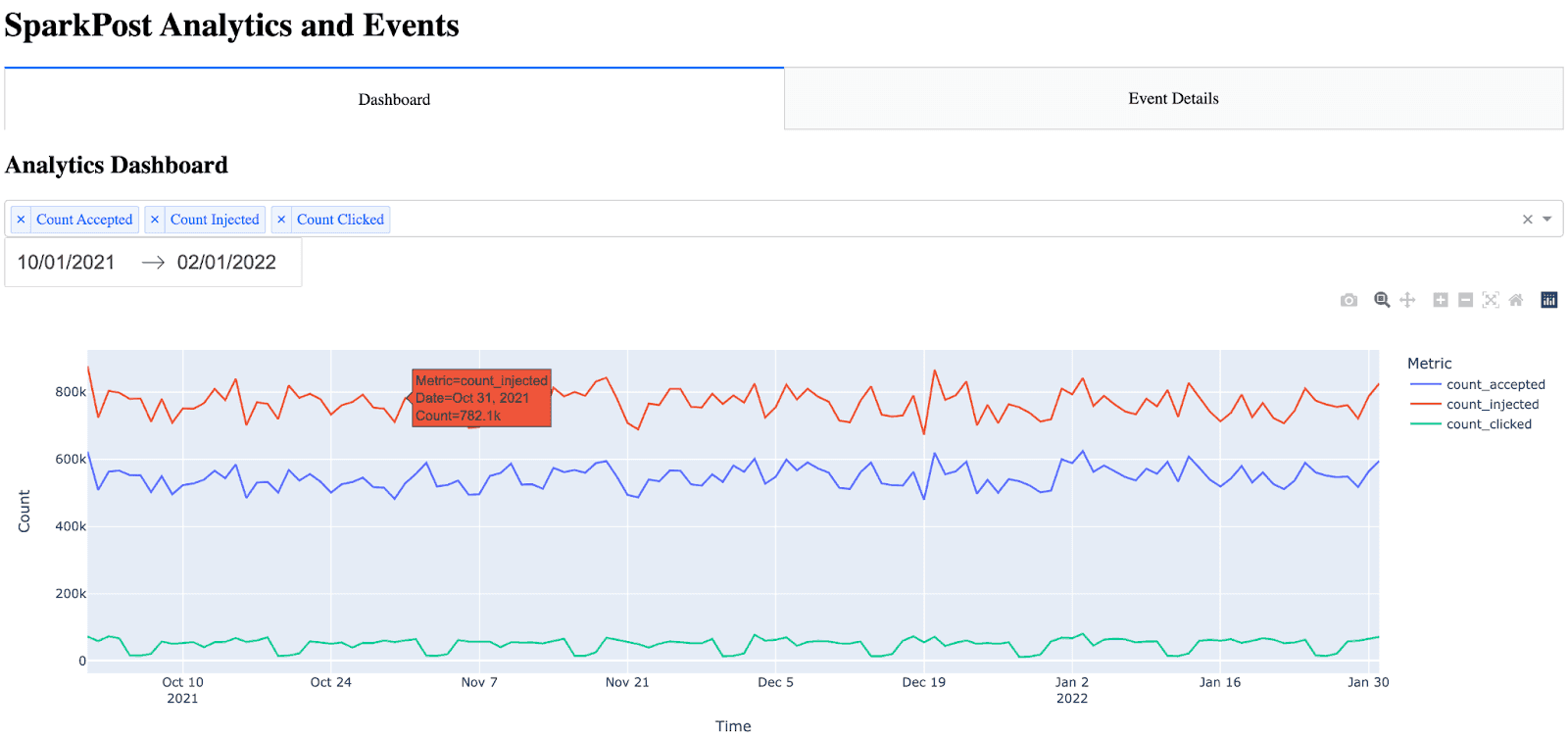
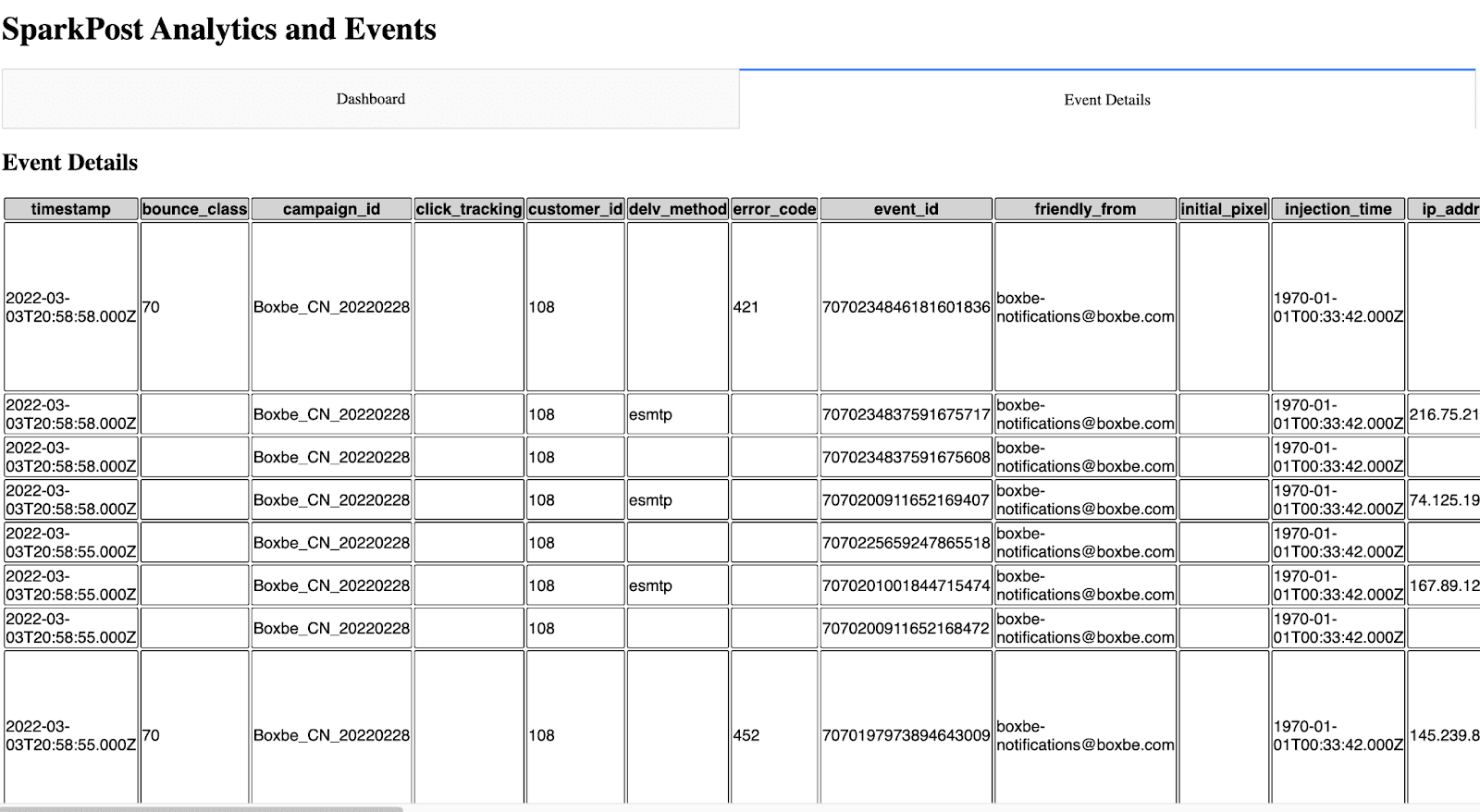
What does the dashboard display?
It visualizes time-series metrics from Bird’s Metrics API and recent event data from the Events API, with options to filter and select metrics over custom time ranges.
How can the tool be expanded further?
By adding deliverability analytics, advanced filters, data caching, and pagination for large datasets to improve performance and usability.
What skills or tools are required to run it?
Basic Python knowledge and installation of requests, dash, and pandas. An API key from Bird is required to pull data.
How does this project fit into Bird’s ecosystem?
It illustrates how Bird’s open APIs can be leveraged to create custom dashboards and reporting tools for teams or clients without access to the full platform.
This script just touches the surface of what is possible utilizing Python, Plotly Dash, and our APIs.
Bird Metrics API + Dashboarding with Python
Almost a year ago, Tom Mairs, Bird’s director of customer success, wrote a mailer tool utilizing Bird APIs. In this post, I pick up where he left off. His tool allows for timed transmission of jobs, but what if we want to create our own dashboards and event logs?
Perhaps I want to create a specific dashboard for a business group or a customer-facing dashboard, but not provide users full access to the Bird UI. This script just touches the surface of what is possible utilizing Python, Plotly Dash, and our APIs. When building dashboards that process high-volume API data, be aware that infrastructure components like DNS can become bottlenecks - we've experienced AWS DNS scaling challenges that affected our data processing capabilities. For visual workflow enthusiasts, you can also explore integrating Flow Builder with Google Cloud Functions and Vision API to add AI-powered automation to your data processing pipelines.
As I began my search online, I wanted to find the path of least resistance. I could have created all the dashboards and UI myself in HTML and python, however, after some Google searching, I came across Plotly’s Dash, which integrates easily with python. I chose Dash for 2 reasons: 1) it is open source, and 2) after reading the documentation it seemed easily customizable for what I was trying to do. Dash is an open-source library that is ideal for building and deploying data apps with customized user interfaces. This made creating a UI extremely simple. The question then became, how complex did I want to make this app? The more time I spent, the more features I wanted to add.
For the initial project, I wanted to ensure that I had a dashboard with customizable metrics and a selectable timeframe. Initially, I started with a dashboard where you could only pick one metric from the dropdown. Then, as I got feedback from colleagues, I refined the dashboard a little bit to add multi-select and axis titles. I also decided to add an additional tab for an events log. I came to the point where I was satisfied with what I had as a good starting point for anyone wishing to build out their own dashboards. For developers who want to feed real-time webhook data into their dashboards, check out our guide on building webhook consumers with Azure Functions. Of course, I put the project in Github for you to clone or branch.
Getting Started
To access this app, you will need to ensure you are running python 3.10 or above and install the following libraries:
Python Library | Purpose |
|---|---|
requests | API communication with Bird services |
dash | UI and dashboard rendering |
pandas | Data processing and table generation |
Then, input your API key into App.py and run the app. It will run on http://localhost:8050. For further information on deploying this to a public-facing server (such as AWS), see the following resources:
Creating the Dashboard Page
Creating the Event Details Page
Next Steps
For someone looking to create their own dashboard or event log, this is a good start. With the customizability here, the sky’s the limit.
As discussed above, some future improvements that could be made are:
Adding deliverability analytics to the dashboard
Adding more filters to the dashboard
Possible caching options so the API isn’t being called every time to display the pages
UI Improvements
Adding filtering and pagination to the event details page
I’d be interested in hearing any feedback or suggestions for expanding this project.
~ Zach Samuels, Bird Senior Solutions Engineer


